Tonic
— Web Design & Development
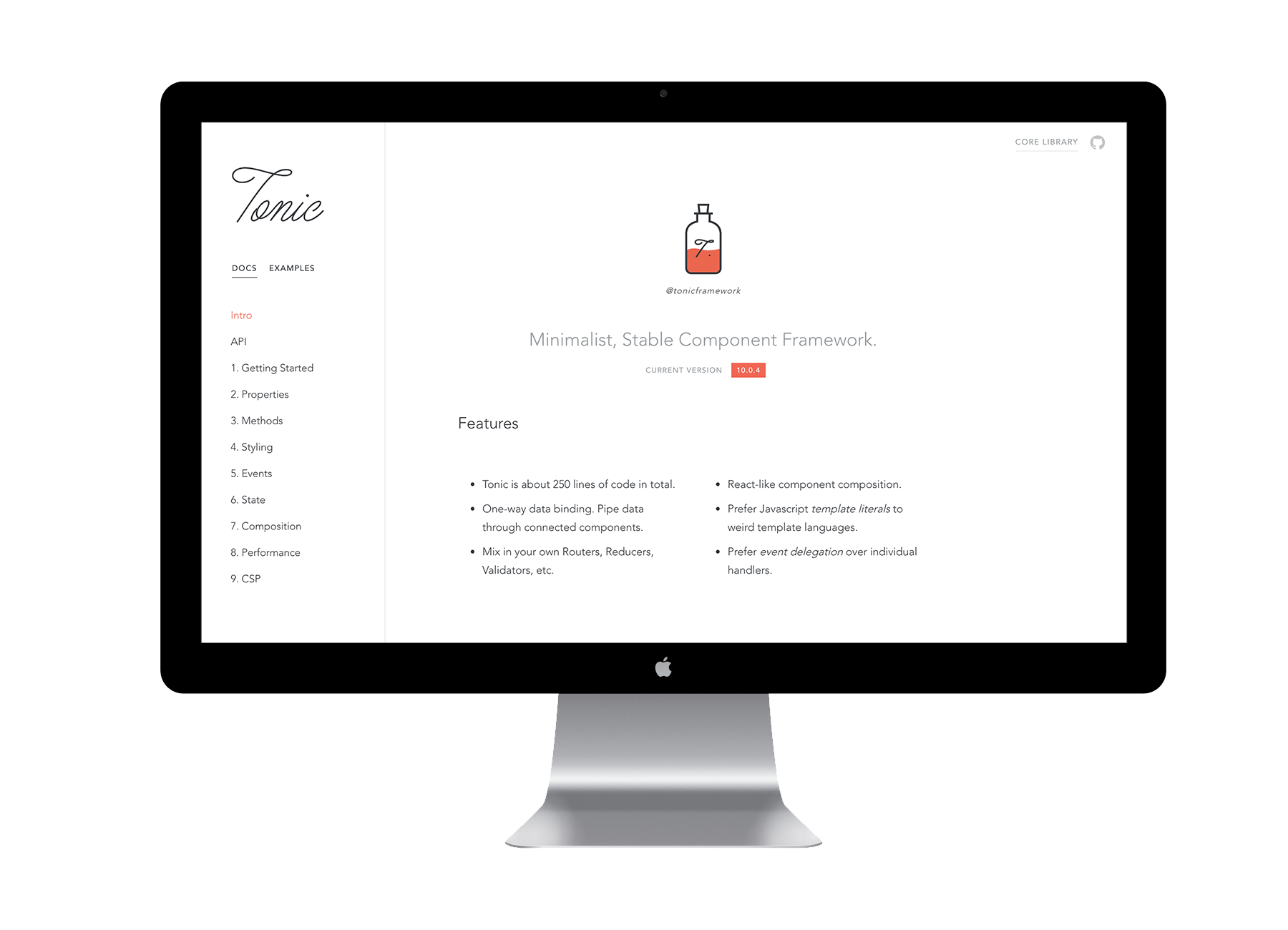
Tonic is a minimalist, stable component framework. It is about 250 lines of code in total, and favours React-like component composition.
Using my previous experience in designing application interfaces, my role in this project was designing and building out the default UI components and themes in the Tonic framework for use in future projects.
Visual Interface Design
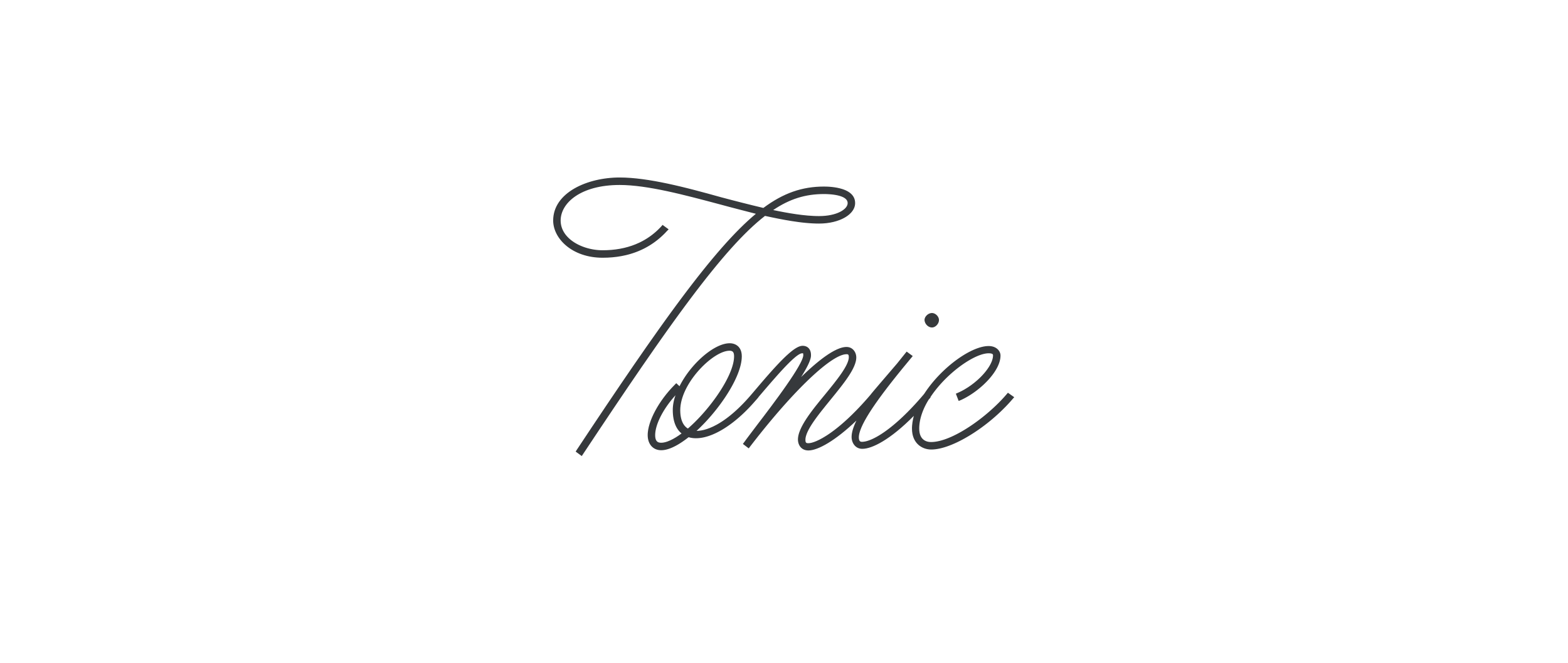
Logo
The logo was designed similarly to the framework, to be simplistic, polished, and refined.
Colour
The default Tonic components are mainly monochromatic, but with a few colours to indicate success or failure states and warnings (red, orange, green).
- Light Gray
- —
- R43 G21 B5
- C97 M0 Y24 K18
- #EAEAEA
- Medium Gray
- —
- R43 G21 B5
- C97 M0 Y24 K18
- #EAEAEA
- Dark Gray
- —
- R43 G21 B5
- C97 M0 Y24 K18
- #EAEAEA
- Black
- —
- R43 G21 B5
- C97 M0 Y24 K18
- #EAEAEA
- White
- —
- R43 G21 B5
- C97 M0 Y24 K18
- #EAEAEA
- Red
- —
- R43 G21 B5
- C97 M0 Y24 K18
- #EAEAEA
- Orange
- —
- R43 G21 B5
- C97 M0 Y24 K18
- #EAEAEA
- Green
- —
- R43 G21 B5
- C97 M0 Y24 K18
- #EAEAEA
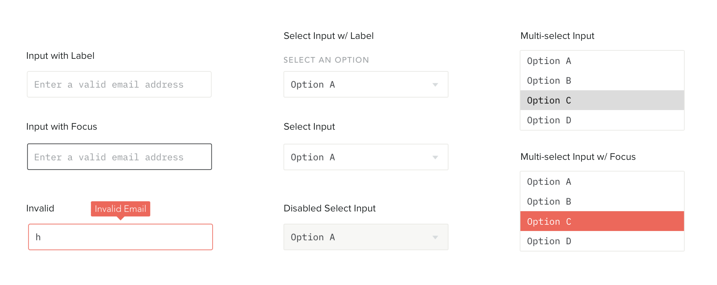
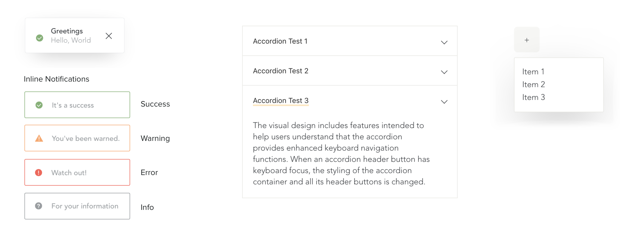
Elements
The default form elements for Tonic components. Each element can be customized (fonts, colours, etc) and I wanted to create a solid base that is well-designed and commincative but also a good canvas for user customization.
All components were also designed and developed to include keyboard support.
Web Design
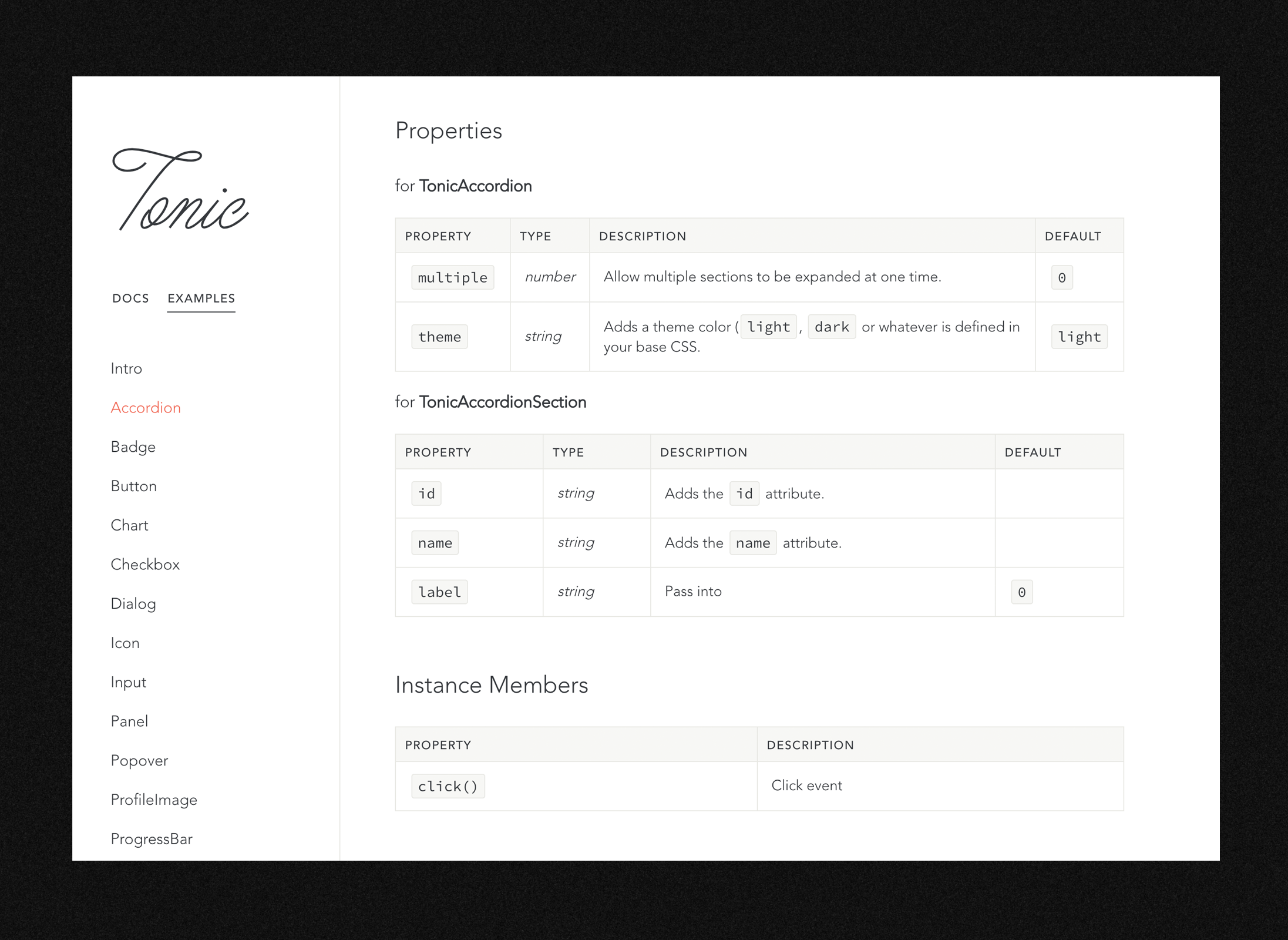
The website was designed to clearly communicate and document the Tonic framework. I contributed to the entire project, including automated testing and writing documentation.
- Core Library:
- P. Fragomeni
- Component Library:
- P. Fragomeni, Aprile Elcich
- Website Design & Dev:
- Aprile Elcich