Maison
Apothecare
Maison Apothecare is a growing maker of exquisite, small batch products made using 100% pure plant derived extracts.
Working with Maison Apothecare, I designed the brand and packaging which helped to strongly establish their place in the local beauty care market in Canada.
Growing from a small wholesale business, Maison Apothecare (originally Modern Apothecary) now sells to department and grocery stores, and has opened three brick-and-mortar shops and an affiliate shop in the UK.
Branding
Logo
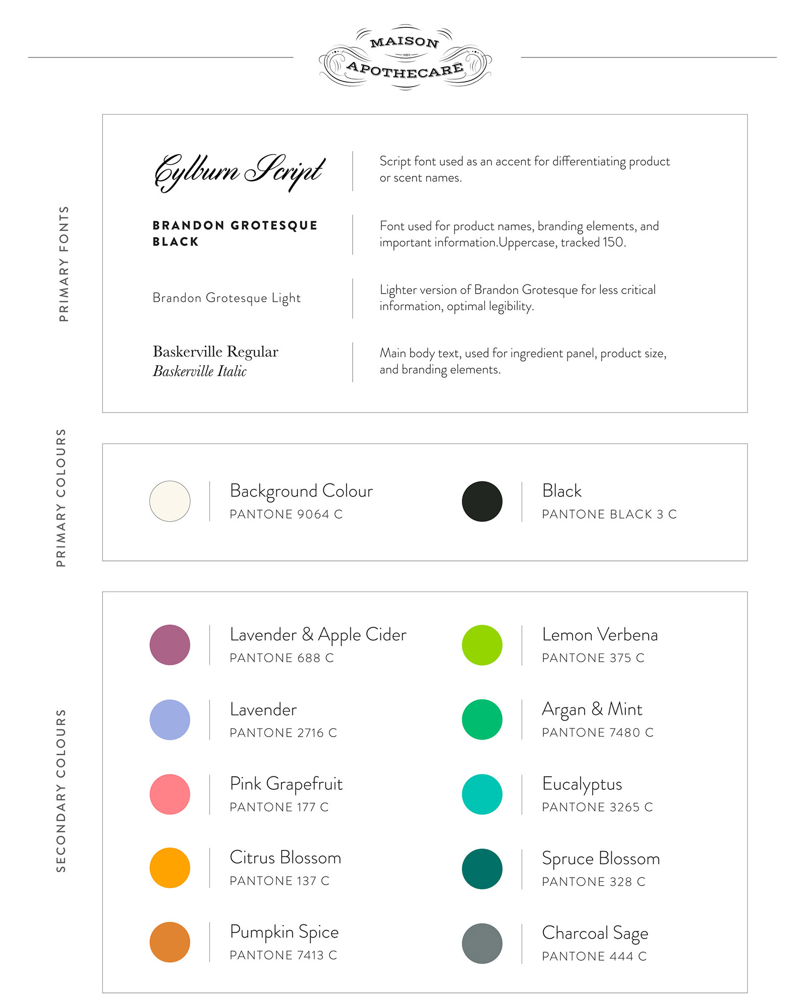
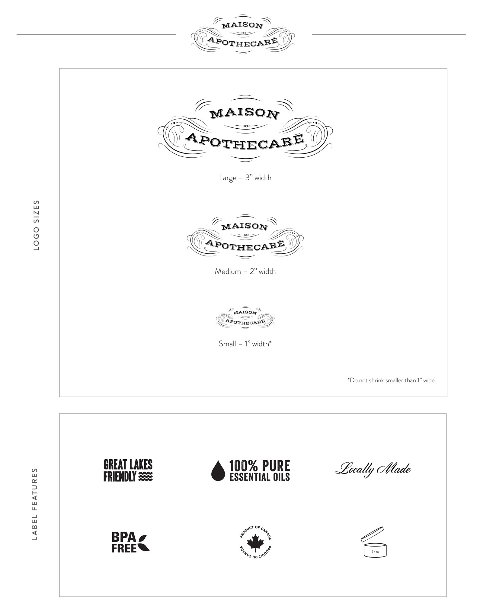
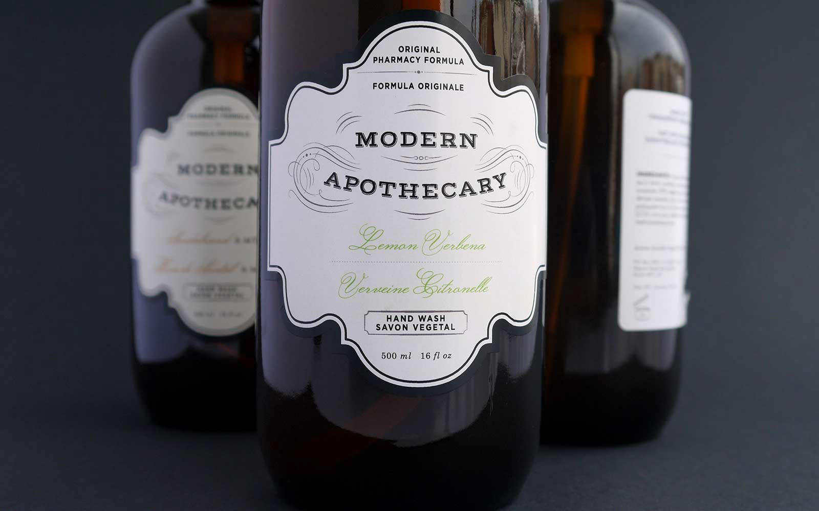
Originally called Modern Apothecary, the name called for a logo that blended modernness with the feeling of an antique apothecary. The mix of antique calligraphic lines with a modern font clearly articulates the intended brand image.

Shape
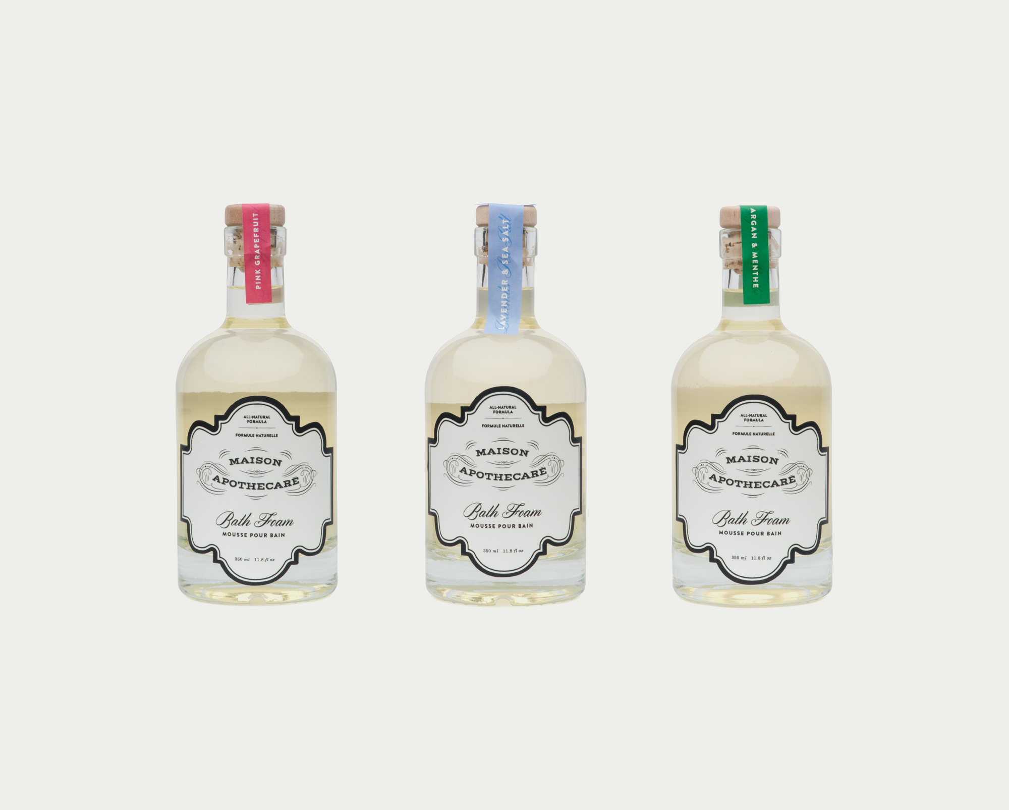
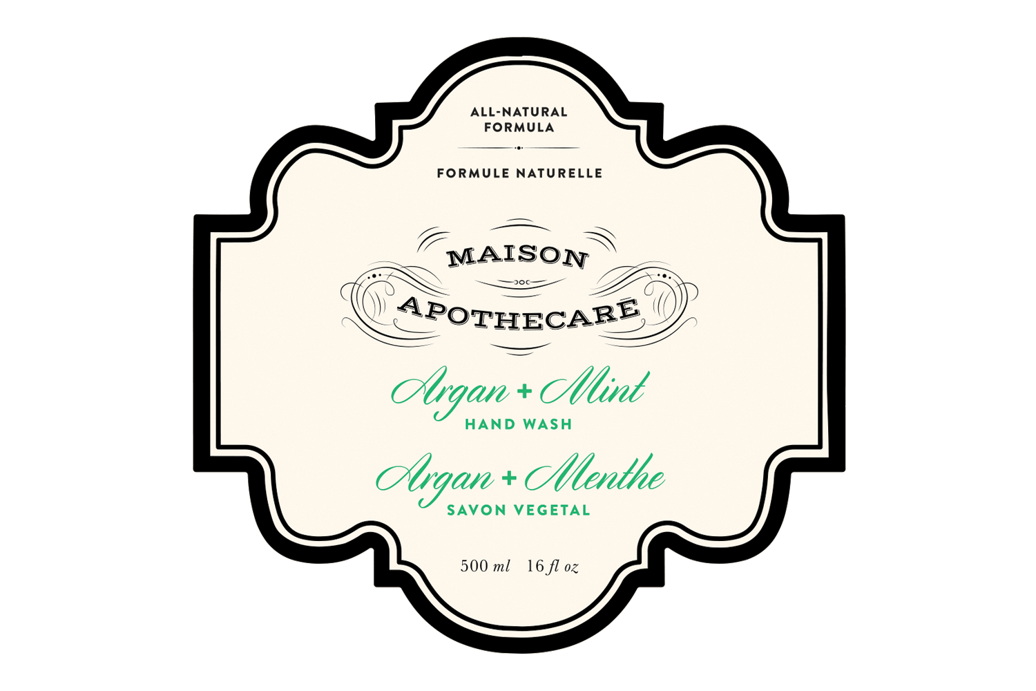
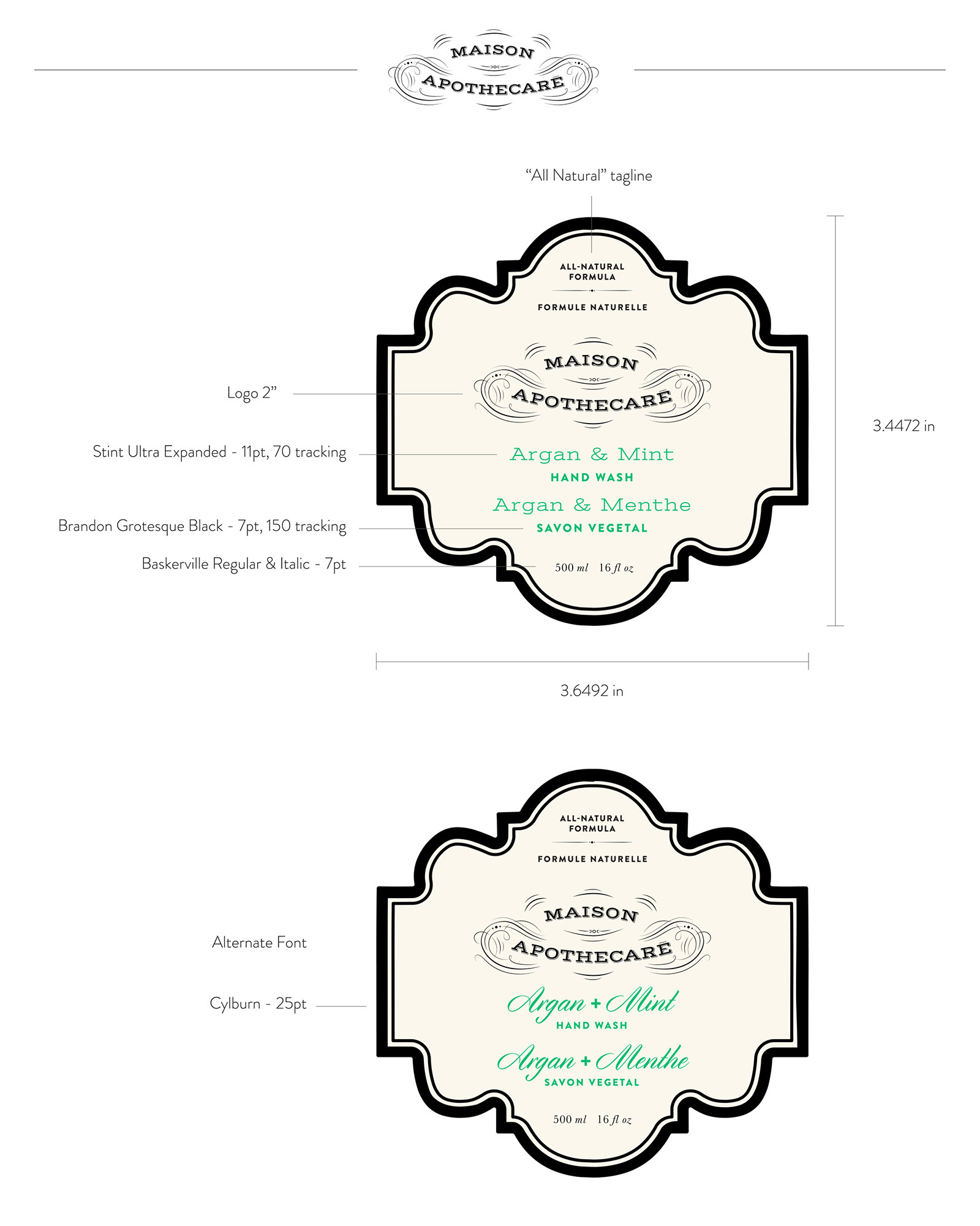
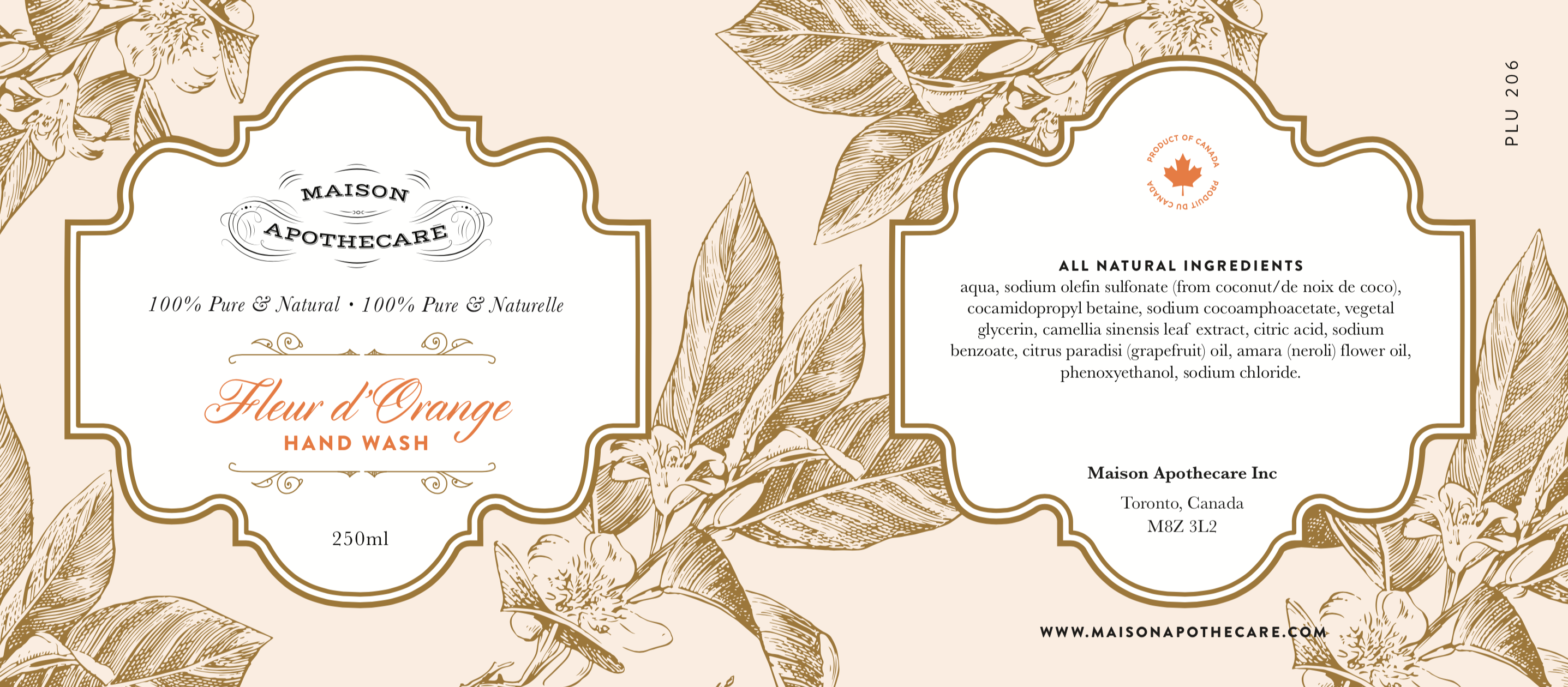
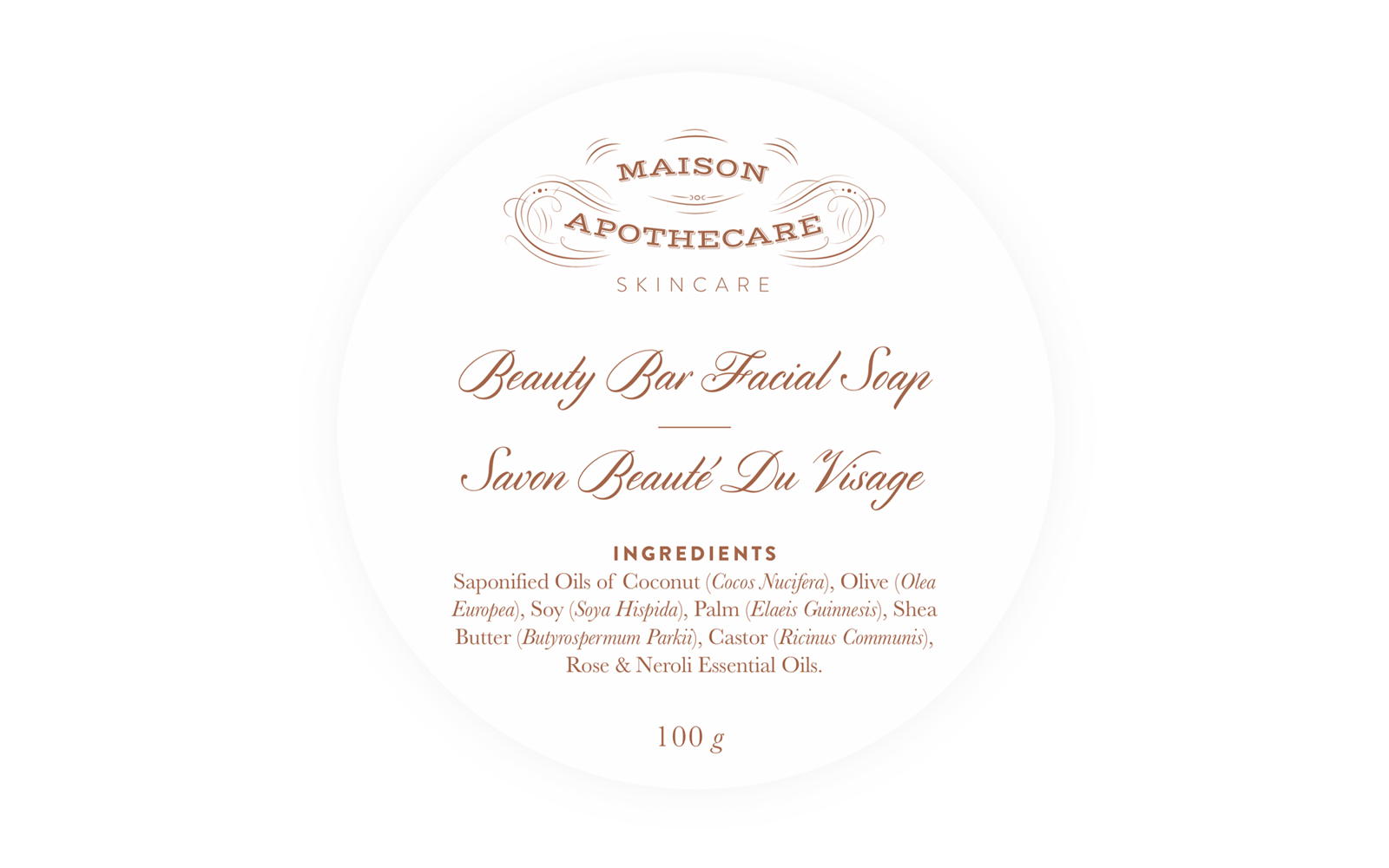
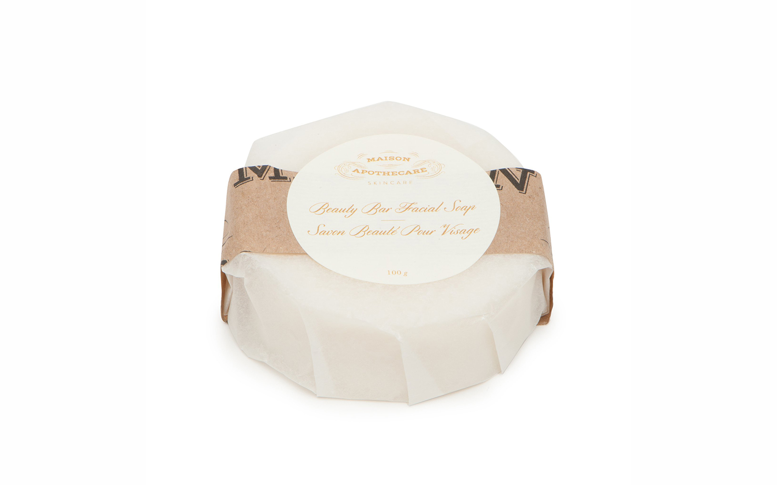
The Maison Apothecare label shape was designed to reflect and complement the shape and antique quality of the logo design. The recognizable and unique label shape is used across the signature product line.
Colour
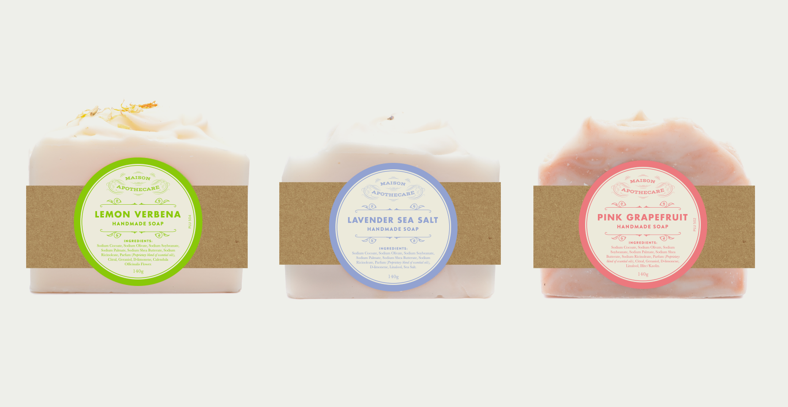
The bright modern colour palette was designed to reflect the upbeat, family-oriented nature of the brand, while also representing the product scents in a familiar way.
- Apple Cider
- —
- R43 G21 B5
- C97 M0 Y24 K18
- #AA6488
- Pink Grapefruit
- —
- R43 G21 B5
- C97 M0 Y24 K18
- #FD828B
- Citrus Blossom
- —
- R43 G21 B5
- C97 M0 Y24 K18
- #FDA328
- Pumpkin Spice
- —
- R43 G21 B5
- C97 M0 Y24 K18
- #E0843C
- Charcoal Sage
- —
- R43 G21 B5
- C97 M0 Y24 K18
- #707C7C
- Lavender
- —
- R43 G21 B5
- C97 M0 Y24 K18
- #A1AfE3
- Pink Grapefruit
- —
- R43 G21 B5
- C97 M0 Y24 K18
- #1FC4B3
- Lemon Verbena
- —
- R43 G21 B5
- C97 M0 Y24 K18
- #97D429
- Citrus Blossom
- —
- R43 G21 B5
- C97 M0 Y24 K18
- #1CBB72
- Spruce Blossom
- —
- R43 G21 B5
- C97 M0 Y24 K18
- #0D7166
Brand Guide
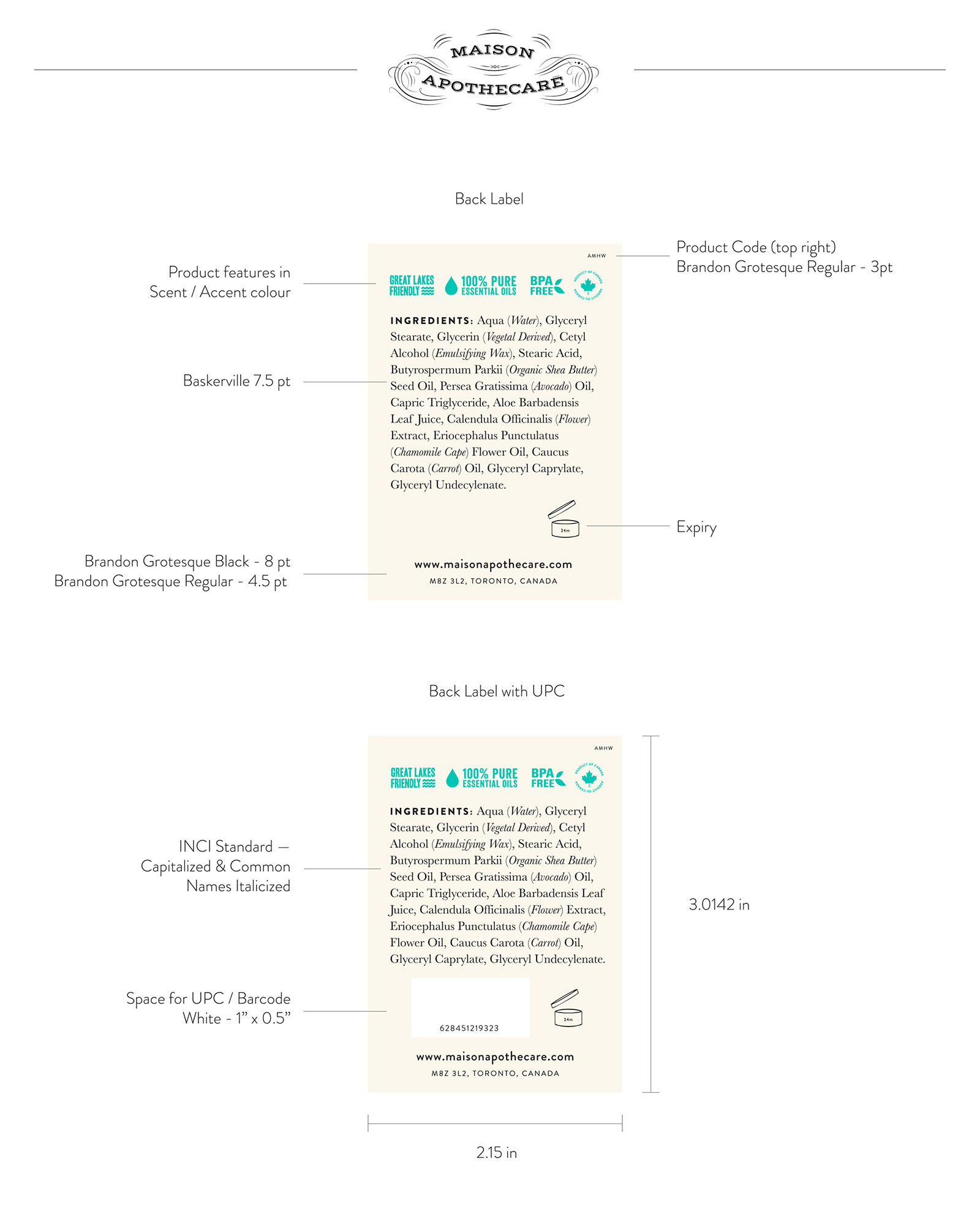
Guidelines for keeping brand consistency within all the various product categories.
Packaging
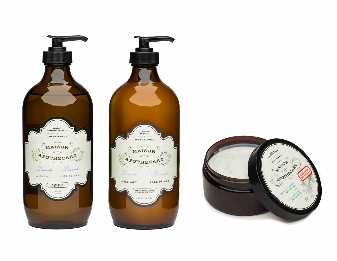
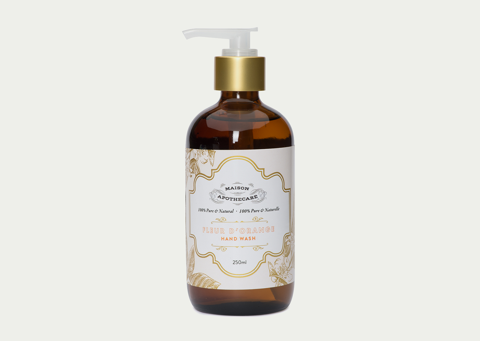
The original Maison Apothecare packaging was designed to be a modern classic, drawing from the vintage apothecary inspiration. The dark brown bottles with the delicate shape label established Maison Apothecare as a familiar and well-loved local brand.
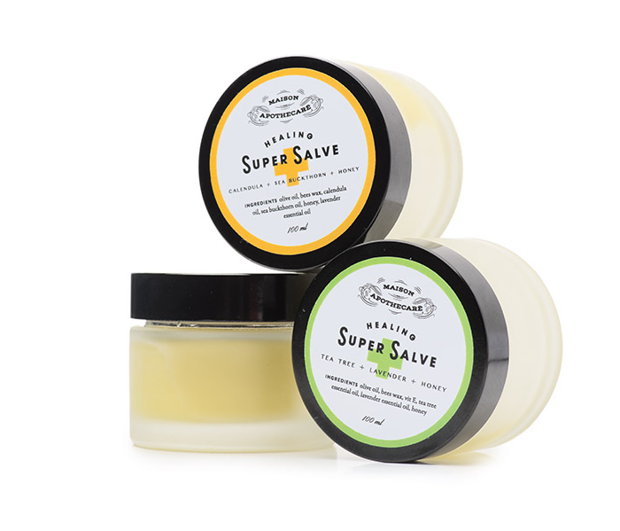
The packaging evolved over time to include more types of products while still living under the umbrella of the established Maison Apothecare brand, modern and elegant while still giving a nod to the original apothecary influence.
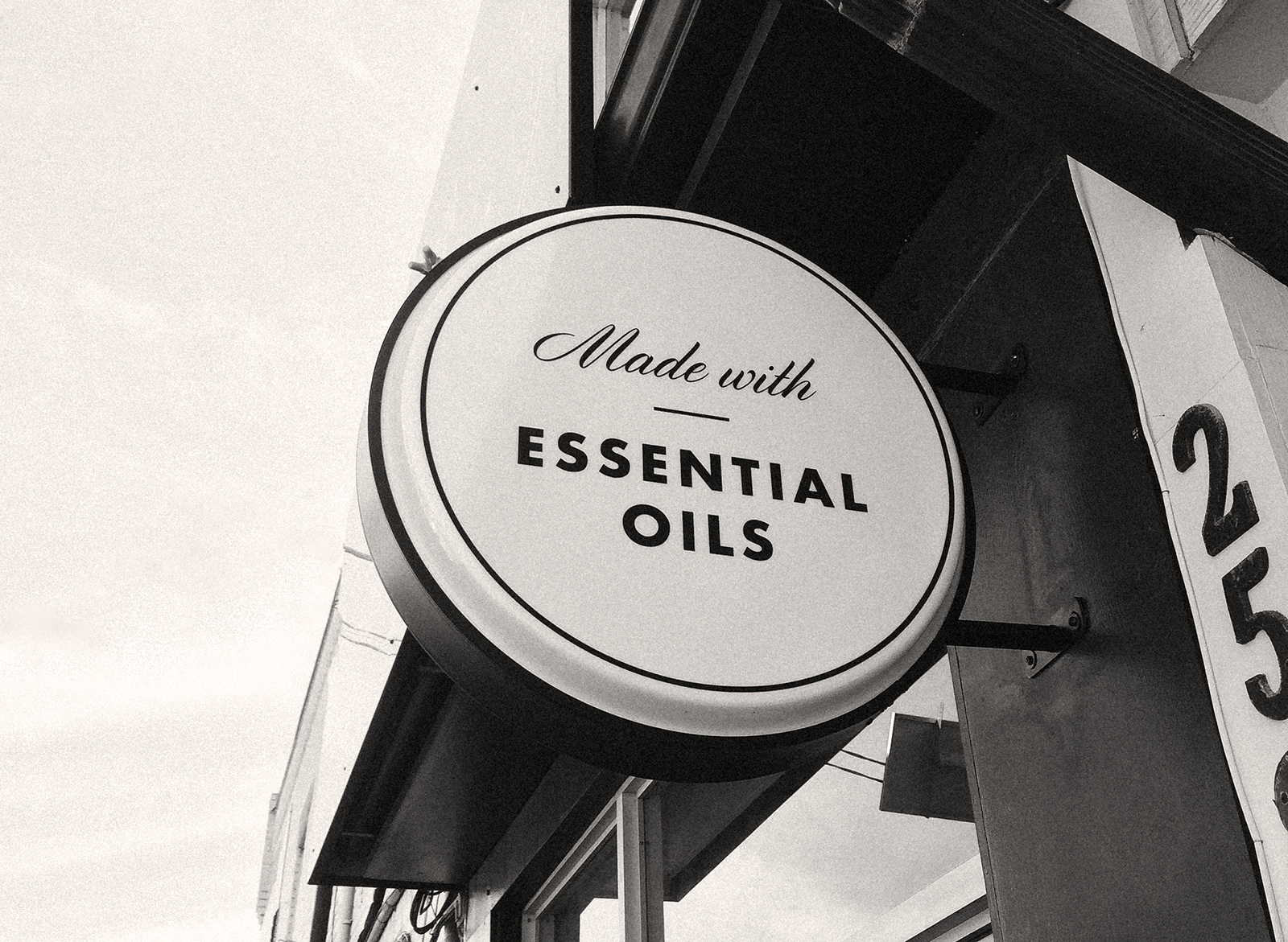
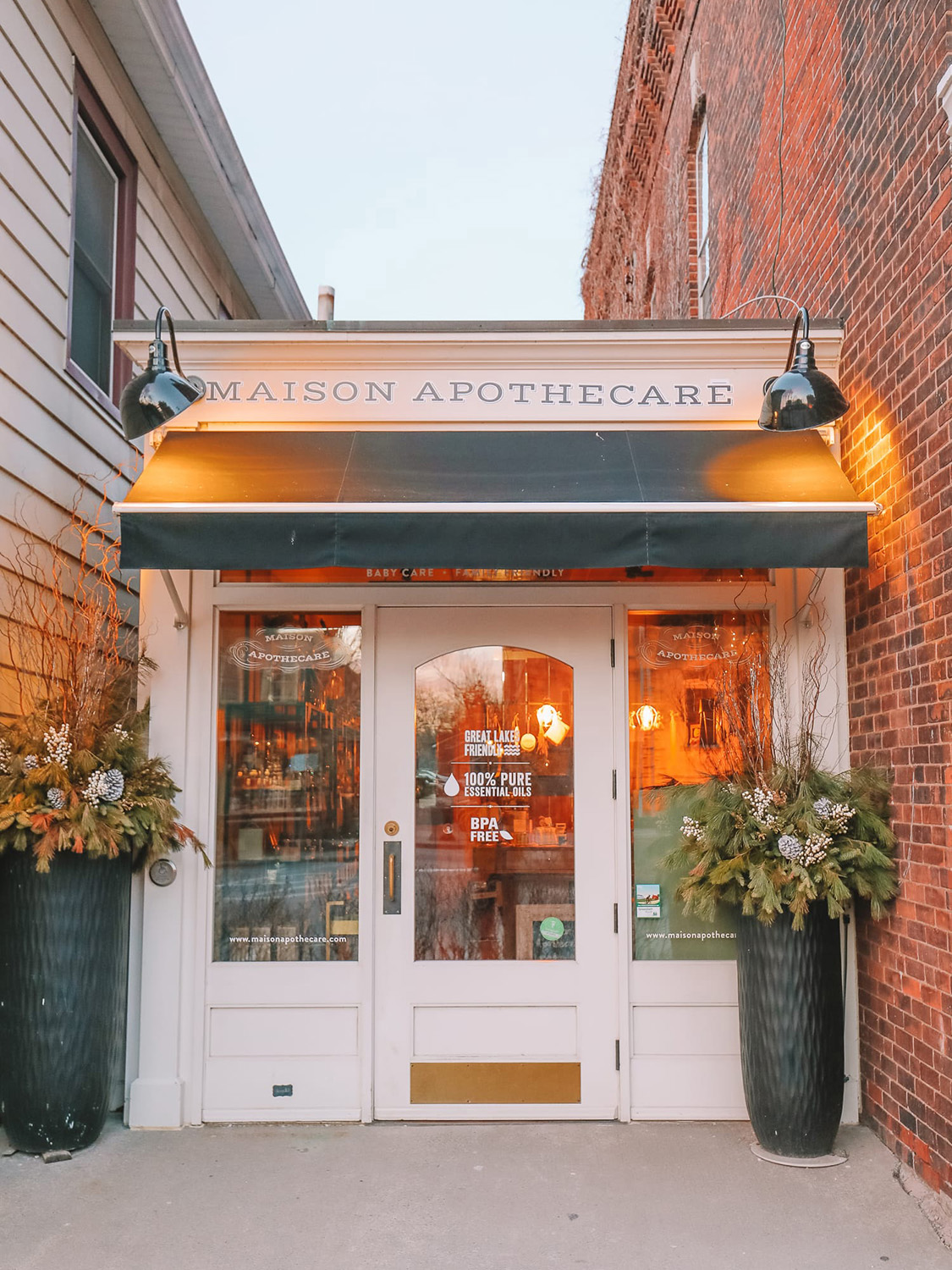
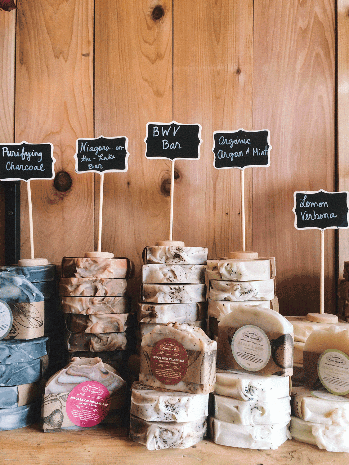
Shop Signage
When Maison Apothecare opened its first shop in Niagara-on-the-Lake, and then in Toronto, the design of the storefront and interior signage was needed to accurately reflect the feeling of the brand, the crossover between modern and classic.
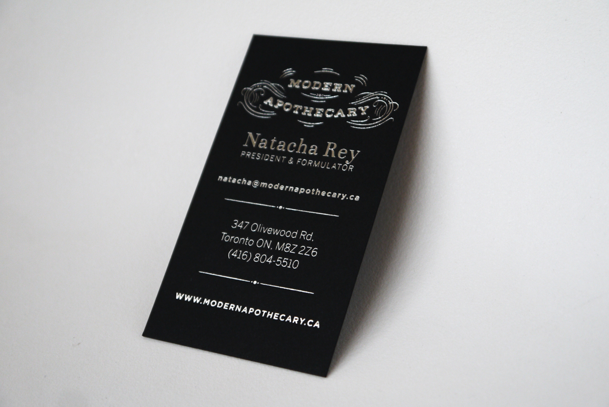
Business Cards
The black business cards with silver foil are a perfect introduction to the Maison Apothecare aesthetic, evoking a vintage chalkboard.
- Client:
- Natacha Rey, Maison Apothecare
- Branding & Packaging Design:
- Aprile Elcich
- Photography:
- Maison Apothecare